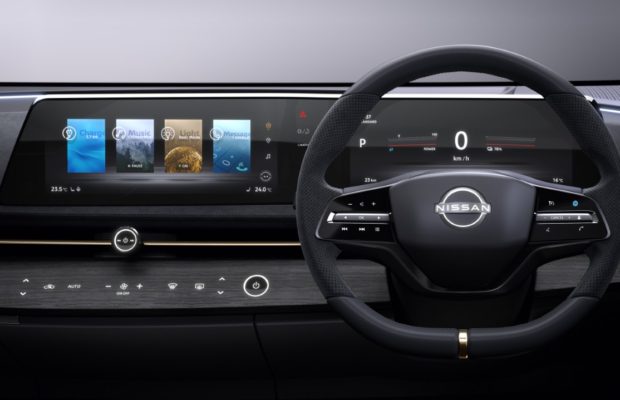
The Ariya Concept’s horizontal `wave’ display is tailored for the human eye

It’s a trend that’s been hard to miss lately: Many new cars have bulky, tablet-like screens smack in the middle of the dashboard. While these super-sized displays may grab attention at motor shows, carmakers working to create next-generation vehicles also have other things to consider as they attempt to balance design, technology and utility.
Nissan chose a different path when developing the display for the Nissan Ariya Concept, prioritizing design and vision over the latest trends. Instead of a tablet, the electric crossover has a curved, two-screen display reminiscent of a wave. It adds to the sense of a “horizon” throughout the car, from elements in the door all the way to the rear of the cabin. The layout reflects Nissan’s new Timeless Japanese Futurism design language, also expressed in the Ariya Concept’s unique frontal “shield.” But the horizontal design wasn’t chosen for its good looks alone.
“The human eye naturally looks from side to side when driving,” explains Tomomichi Uekuri, senior manager of HMI engineering team. “People can see and absorb more information if it’s laid out horizontally. Peripheral vision works this way as well.”
In addition to conveying information better for the human eye, the layout does so from a safer location — in the line of sight, closer to the road. By matching the cabin’s horizon aesthetic, it becomes a seamless part of the dashboard. Nissan’s design team calls this engawa – the undefined space between where you are, and where you are going.
The Nissan Ariya Concept’s display keeps driving information in an instrument cluster location similar to that of a traditional car, while displaying entertainment information, comfort controls and system status in the center screen. Both are wrapped together in a sleek panel that flows seamlessly between driver and passenger.
Even though there are two screens, information can move or be swiped between them to create the feeling of a single display. For example, if you want your route directions and map in front of the steering wheel, they can appear there. They can also move to the center, or disappear when no longer needed.
“The display’s wave construction is innovative and utilizes an ergonomic layout for both the meter display and the center display, not only for visibility, but also allows the driver to easily reach the center display touch screen,” Uekuri explains. https://globalcommsdml.com/#/media-library/projects/rknCkKK/photo/pansWB3
Like other parts of the Ariya Concept, the display is meant to convey a fully functional impression. From music to GPS, it was important for the designers and engineers to show the world what a near-future Nissan could achieve. The user experience is even demonstrated at the granular level, allowing the driver to adjust how much data is shown in each location, removing unnecessary information from the driver’s peripheral.
It took the design team many iterations to arrive at the Ariya Concept’s innovative display. The team built similar displays into a large black “box” that they affectionately named “the Monolith,” a nod to the movie “2001: A Space Odyssey.” They chipped away, figuratively speaking, at the housing until it became what’s seen in the final concept car.
As a result, the sleek, seamless display looks like a natural, integrated part of the Nissan Ariya Concept’s interior design – not a slab out of time and place.
For more information about our products, services and commitment to sustainable mobility, visit nissan-global.com. You can also follow us on Facebook, Instagram, Twitter and LinkedIn and see all our latest videos on YouTube.


0 comments